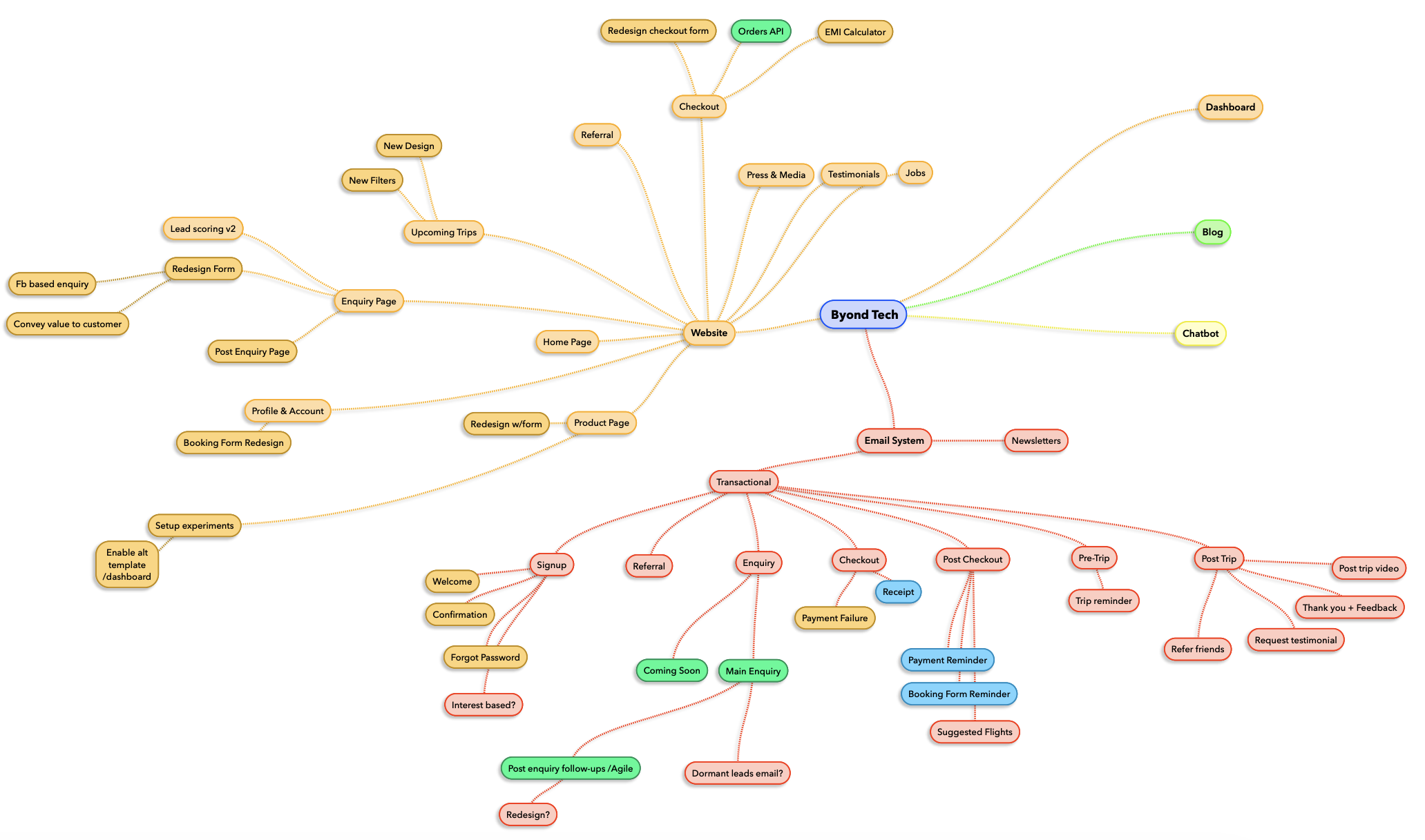
What happened when we mapped every automated message a traveller could receive — and why the map fixed more than the emails did.
Most email systems aren't designed. They accrete.
Someone needs a payment reminder, so a payment reminder gets built. A quarter later, marketing wants a post-trip feedback email, so that gets bolted on too. Different people, different months, different tools. Each email made complete sense on the day it was made. But nobody was holding the whole picture — because there was no whole picture. Just a pile of individual messages, each locally reasonable, collectively a mess.
We picked up Byond Travel's email system in roughly this state. And before touching a single template, we did the least glamorous thing possible: we drew the whole thing out.
Why a map
For most e-commerce, the customer journey is a funnel. See product, buy product, get receipt, maybe get a "you might also like." Short, linear, and the emails more or less write themselves.
Travel isn't that.
Booking a trip is a high-consideration, long-cycle, emotionally loaded decision that can stretch across months. People enquire before they buy. They pay a deposit now and a balance later. There's a booking form to fill, flights to sort, a countdown to departure, the trip itself, and then a whole afterlife of photos, feedback, and "you have to go too" conversations with friends.
So the journey isn't a funnel — it's a relationship. And email is the thread running through all of it.
When the thread is designed, it feels like a brand that's paying attention. When it isn't, the customer gets three reminders about the same payment, radio silence for the two weeks they were actually deciding, and a "how was your trip?" that arrives before they've left.
Mapping is how you see the thread. Everything else follows from that.
What the map actually was
We put the brand at the centre and let two systems branch off it: the website (all the places a customer touches the product) and the email system (every automated message that touches the customer). This post is about the second one, but the two are joined at the hip — nearly every email is triggered by something happening on the site.
The email side organised itself into a lifecycle spine, one cluster per stage of the relationship:
- Signup — welcome, confirmation, password reset
- Enquiry — the first real conversation, follow-ups, re-engagement for leads that went quiet
- Checkout — receipt, payment failure
- Post-checkout — payment reminders, booking-form nudges, suggested flights
- Pre-trip — the countdown and the "here's what to pack" moment
- Post-trip — feedback, testimonials, referrals, the trip video
Then we added one more layer that turned out to be the most useful part: colour
as status. Green for what we still had to build, a distinct colour for the ones
already live, and — my favourite — a colour reserved for the nodes that were
really questions, not tasks. On the map those show up literally with question
marks: interest based?, dormant leads email?,
redesign?. Encoding "we're not sure this should exist yet" as a
first-class node is a small move that keeps a map honest. It stops the diagram
from pretending to be a plan when half of it is still an open debate.
What the map surfaced
This is the part I'd underline for anyone thinking about doing this. The value isn't the pretty diagram. It's what becomes impossible to un-see once everything is in one frame.
Gaps. The most incomplete cluster was enquiry — which, for a travel brand, is exactly the wrong place to be thin. Enquiry-to-booking is the longest, most human, most winnable stretch of the whole journey, and the map showed almost nothing supporting it: no proper follow-up cadence, no re-engagement for leads that had gone cold. Someone would enquire, get one reply, and then get silence during the precise weeks they were making up their mind.
On the map, that silence is a branch with no leaves. You can't argue with an empty branch.
Manual work pretending to be a system. A big chunk of the post-checkout cluster — payment reminders, booking-form nudges — was being done by hand, or half-built and inconsistent. In travel this matters more than most places, because the deposit-now-balance-later model means there's a long, awkward window between "booked" and "fully paid." Seeing those nodes lined up together made it obvious they were all the same shape of problem: event-driven messages that should fire off a trigger, not off someone remembering to send them.
Inconsistency. Emails built years apart by different hands look and behave differently. Laid side by side, the "we should just redesign these" cases stopped being vague grumbling and became a specific, scoped list.
Orphans and duplicates. A few emails overlapped, doing near-identical jobs from different stages. A couple of moments where you'd expect an email had none. Both are easy to miss when you only ever look at one email at a time, and glaringly obvious in a single view.
What we could then streamline
Once the map existed, the fixes mostly picked themselves.
The clearest win was separating triggered emails from sent ones. Anything driven by an event — a receipt when a payment clears, a reminder a set number of days before a balance is due, a nudge a set number of days before departure — is automation waiting to happen. The map let us tag every one of those and hand engineering a clean list instead of a vibe.
The second was turning ad-hoc chasing into designed sequences. "Post-enquiry follow-up" stopped being a person occasionally remembering to check in and became a deliberate cadence with its own logic. Same for re-engaging dormant leads. Once it's a sequence on the map, it can be built, measured, and improved like anything else.
The third was less about email and more about ownership and priority. When every message and its status lives in one artifact, "what's live, what's next, what's still an open question" is answerable at a glance — by a designer, a marketer, and a developer looking at the same picture. That shared reference did as much for how the team worked as any individual email did for a customer.
The map isn't the deliverable
If there's one thing I'd take from this, it's that the diagram was never the point. Nobody ships a mind map. What we actually shipped was clarity — the ability to see an entire, sprawling, accreted system at once, and to tell the difference between a gap, a duplicate, a manual chore, and a genuine open question.
Mapping a messy system before you touch it is one of the cheapest high-leverage things you can do. A couple of hours with the whole thing on one canvas surfaced problems that had been quietly costing bookings for months, and it made the fixes feel less like guesswork and more like joining dots that were already there.
The emails nobody designed, finally designed. Mostly by drawing them first.