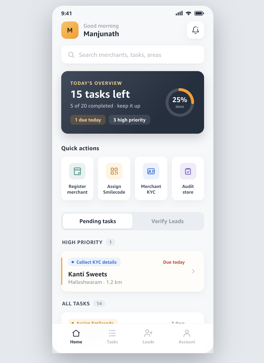
Fleet-on-Street — FOS, to everyone who used it — is the app Amazon's field agents carry while onboarding local merchants: kirana stores, sweet shops, tiffin centres. There was no app before it. We started from a blank canvas and a simple-sounding brief: help an agent walk a beat and turn every shop they visit into an onboarded merchant.
The simple-sounding brief is where all the hard problems hide. What follows is less about how the screens look and more about the decisions underneath them — and what each one cost.
The user sets every constraint
Before a single screen, the thing that shaped everything was where this app gets used. Not at a desk. In a shop, in the sun, one-handed, mid-conversation with a shopkeeper who is also running a business while you talk. Sessions are seconds long, not minutes. The phone is mid-range, the network is unreliable, and the agent's attention is the scarcest resource in the room.
That reframes the design problem entirely. The app isn't competing with other apps for engagement — it's competing with the conversation happening in front of the agent. Every decision below is really a decision about how little the app can ask of someone who can't afford to look down for long.
Glanceability vs. capture
The central tension of the whole product: the field agent needs to see almost nothing, and the back office needs the agent to capture almost everything. KYC, business details, store audits — that's a lot of data entry, and data entry is exactly what you can't do well while standing in a shop.
We resolved it by splitting the two moods of the app cleanly. The list view is built for glancing — what's next, where, how urgent — and carries the absolute minimum per row. The capture flows live one layer down, entered deliberately, one task at a time.
By keeping the list sparse we hide useful detail. We decided a calm list that gets glanced at fifty times a day beats a dense one that gets avoided.
Ordering the day
A task list has to answer "what should I do next?", and there are three honest answers: what's most urgent (deadline), what's closest (distance), or what matters most (priority). They routinely disagree. The nearest shop might not be due for days; the most urgent task might be across town.
We led with deadline and priority, surfaced distance as a secondary cue on each card, and consciously didn't auto-route the day. Route optimisation is seductive but it takes control away from an agent who knows their beat better than we do — the shop that's technically nearest might be shut till noon. So the trade-off we took: the app advises, the agent decides. A map-based route view is the obvious next thing, but as an option, not a default.
What to show first
The first screen had to answer the only question an agent has at 9am — how much is left, and what's urgent? — without becoming a dashboard. Dashboards are where field apps go to die; every extra number is another thing to parse.
So the top of the app is a single overview: a plain-language count, a progress ring you feel rather than read, and two chips for "due today" and "high priority." The trade-off here was motivation vs. utility. The progress ring is arguably decoration — it doesn't tell the agent anything the count doesn't. We kept it because field work is lonely and a sense of momentum matters, but I'll admit it's the one element I'd test hardest before defending.
Colour as a system — and its cost
Every task type owns one hue, used everywhere that type appears — its quick-action icon, its badge on every card. KYC blue, Smilecode orange, business teal, audit violet. The payoff is that agents stop reading labels and start scanning colour, which is exactly right for someone glancing between conversations.
The cost is accessibility. Colour-coding quietly excludes anyone with a colour-vision deficiency, and "just look at the colour" is a promise you can't keep for everyone. So colour is never the only signal: every badge also carries its text label and a filled dot, and nothing in the app depends on hue alone to be understood. Colour accelerates recognition for most; it's never load-bearing on its own.
Designing calm under stress
An early build had big rounded corners, generous shadows, and a merchant monogram on every row. It looked designed — which, for an app used under stress, is a failure mode. Visual energy reads as noise when you're already busy.
So the whole system got quieter. Tighter corners, a soft low-contrast shadow so cards float a millimetre off the page instead of popping off it, and the monograms cut entirely — the colour-coded badge already says what kind of task it is. The high-priority card was the sharpest trade-off: it needs to win attention, but shouting for it makes the whole screen tense. It ended up as a faint warm background and a single thin edge marker — unmistakably first in line, without raising its voice.
Navigation trade-offs
Two calls worth naming. First, a segmented control instead of tabs for Pending vs. Verify — it makes the two modes feel like one toggle rather than two destinations, which matches how agents actually switch between them. Second, the floating "+" button I prototyped early and then cut. It was ambiguous about what it did and it duplicated the "Register merchant" action already sitting in the quick row.
When a control has to be explained, it's usually the wrong control — so it went, even though a FAB is the "expected" pattern.
Typography
FOS is set in Amazon Ember, the brand typeface — humanist and quietly confident, which suits an app that should feel dependable rather than flashy. The trade-off is practical: Ember is proprietary, so the app leans on a system-font fallback stack for any environment where it isn't available. Names and numbers get its real weight where it renders; nothing breaks where it doesn't.
What we're still figuring out
A product like this is never really done. The open questions are the good ones: how to make capture flows survive a dropped connection gracefully, whether the progress ring earns its place, and how far to trust route optimisation before it starts overriding an agent's judgment. The spine is solid — a calm first screen, a colour system you read at a glance, and elevation quiet enough to trust under pressure. The rest is what the next round of field testing is for.