How mapping one traveller's journey — from idle daydreaming to becoming "the expert" at dinner parties — stopped being a diagram and started telling us what to build.
A few years ago I worked with a travel company that did the kind of trips people talk about for years afterward. The problem wasn't the product. The trips were genuinely good. The problem was everything around the trip: the marketing ran on gut feel, the content calendar was a pile of half-formed ideas, and nobody could quite agree on who we were even talking to. Was the person reading our blog the same person about to wire us a deposit? Obviously not. But we were treating them like they were.
So I did the unglamorous thing. I opened a spreadsheet and started mapping the entire journey a customer takes with us — not the funnel, the journey. The messy, emotional, months-long arc from "I wonder where I should go this year" to "let me tell you about this incredible trip I took."
Here's what that turned into, and what I'd tell anyone doing it for the first time.
The frame: stages across the top, feelings down the side
Most journey maps you'll see online are a single row of stages — Awareness, Consideration, Purchase, Retention — with a smiley-face emotion line wiggling underneath. That's a fine cartoon. It's not very useful.
The version that actually earned its keep had two things going for it.
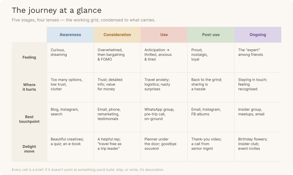
First, it broke each stage into who the person actually is at that moment. "Awareness" isn't one person. It's a casual browser idly consuming travel content, someone searching with intent who's ready to plan, and someone brand-aware who already follows us and heard about us from a friend. Those are three different humans with three different needs, and lumping them into one "awareness" box is how you end up writing content that lands with nobody. So the top of the map read: Awareness → Consideration → Use → Post-use → Ongoing, and underneath each of those sat the specific moments — casual browser, with intent, brand aware, in progress, customer, pre-travel, on-travel, post-travel.
Second, it stacked a set of lenses down the side and forced me to fill in every cell for every moment:
- What are they doing?
- What are they feeling?
- What outcome do we want here?
- Where does it hurt (pain points)?
- Which touchpoints actually reach them?
- What could delight them?
- What content does this moment need?
- And — my favourite — what do we still not know?
The grid does something a slide can't. It makes the gaps embarrassing. An empty cell under "delight actions" for a stage is a visible admission that you have no plan for that moment. You can't hand-wave past a blank box.
The story the map told
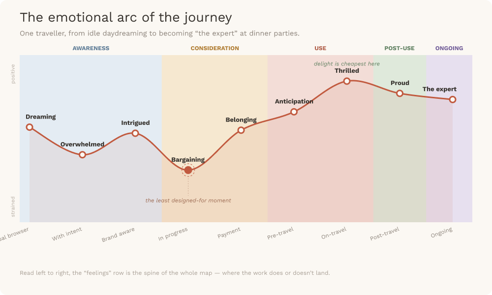
When you read the map left to right along the "feelings" row, a real person comes into focus. And they're not a funnel. They're a mood ring.
They start out curious, dreaming, aspiring — pleasantly lost in travel content, not ready to buy anything, just fantasising. Push a hard sell here and you've killed it.
The moment they start seriously looking, they flip to eager but overwhelmed. Too many options, not enough trust, too much clutter. The pain point wasn't a lack of information — it was too much of it, with no way to tell what was relevant.
Then comes the part everyone forgets to design for: the bargaining. As they get close, they turn cautious, careful, combative — because they're negotiating — laced with FOMO and a low hum of uncertainty. This is the least romantic stage and the one that most needs a human being on the other end. One of my "outstanding questions" for this stage was literally: can we make phone calls delightful? I still think about that one.
Pay, and the feeling switches almost instantly to belonging. Then, in the run-up to the trip: excitement and anticipation, shadowed by a very specific set of anxieties — what to pack, what about my pets, my kids, my ageing parents, is it safe, what's the destination actually like. These aren't objections to overcome. They're a person quietly panicking about logistics, and every one is a content opportunity. (A pre-trip prep call we ran for one group got some of the best feedback we'd ever seen. It cost us almost nothing.)
On the trip itself: thrilled, anxious, tired — all at once. And this is where the map got fun, because it's where delight is cheapest and most potent. A daily planner slipped under the door. An icebreaker on night one. A goodbye letter and a small souvenir left in everyone's room on the last morning. None of it expensive. All of it unforgettable.
And afterwards? Proud, nostalgic, loyal. The customer becomes something new: the expert. The person at the dinner party holding court about the trip they took. If you've done the journey right, your best marketing channel is now a human being who paid you and left glowing.
The turn: from description to instructions
For the first week, the map was just a very detailed description of reality. Interesting, not useful.
The shift happened when I stopped treating each cell as an observation and started treating it as a brief. "Feels overwhelmed by too many options" isn't a fact to note — it's an instruction: make a curated, trustworthy entry point. "Bargaining stage feels combative" becomes: reworked email copy and a genuinely helpful rep, not a discount reflex. "Post-trip, they want to share but it's a hassle" becomes: build the album, cut the video, make sharing one tap.
By the end, the right-hand columns of the map had quietly reorganised themselves into an actual roadmap: ad copy to rework, a newsletter to revamp, a loyalty programme, VIP benefits, WhatsApp group management, branded on-trip experiences, feedback emails, an insider's club. Not a wishlist. A prioritised list of things, each one traceable back to a specific feeling in a specific moment.
A journey map is only worth making if every cell eventually points at something you'll build.
What I'd tell you before you make yours
- Map feelings, not just actions. The actions row tells you what happens. The feelings row tells you why your work isn't landing. Skip it and you've made a flowchart, not a journey map.
- Segment inside each stage. "Awareness" is three different people. The casual browser and the ready-to-book searcher do not want the same email. Splitting the stages is where the map earns its keep.
- Design for the boring stages. Everyone lavishes attention on the exciting moments and ignores the bargaining, the pre-trip logistics panic, the back-to-the-grind comedown. Those are exactly the moments a competitor is winning or losing you.
- Keep an "outstanding questions" row and leave it messy. Can we make phone calls delightful? How do we get all ten people on a trip to share the video? The unanswered questions are the map's honest edge. They become your next round of experiments.
- Treat every cell as a brief. If a box doesn't imply something you could build, ship, or write, it's decoration. Delete it or act on it.
- Let it stay alive. The trips changed, the channels changed, the customers changed. The map that helps is the one you keep editing, not the beautiful one you framed and forgot.
The map didn't tell us anything we couldn't have known. Everyone on the team already sort of knew the customer was overwhelmed here or anxious there. What it did was put all of that in one place, make the gaps impossible to ignore, and quietly turn a year of vague good intentions into a list of things we could actually do on Monday.
That's the most useful thing a spreadsheet ever did for me.